

Building an Engaging Association Website: 5 Tips
Growing your association can be an exciting if not challenging task. From creating new content and expanding your marketing to making sure you’re retaining current members, there are a variety of ways to grow your membership and multiple factors you’ll need to consider. Of these factors, your website should be a top priority.
The best association websites are engaging, accessible, and clearly communicate the organization’s brand and values at a single glance. Whether you’re looking to make some minor updates to your website or completely redesign it, these websites can be a valuable source of inspiration.
Of course, knowing a website is engaging and being able to explain why it’s engaging are two different things. To help your association bridge this gap and design an engaging online experience for your members, this article will dive into five web design tips:
-
Make it accessible.
-
Use a simple navigation.
-
Create compelling CTAs.
-
Use a variety of visuals.
-
Keep loading times short.
Your association’s team should be able to implement many of these tips yourself, but if you’re looking to launch a new website, make a major change, or run into any technical issues, consider reaching out to a web design consultant. Let’s dive in.
1. Make it accessible.
Your website should engage all of your members, and it can by incorporating inclusive design best practices. Optimizing your website for accessibility can improve all visitors’ user experience (UX), regardless of their ability.
Accessibility includes a wide range of factors, including ensuring your website is mobile friendly and has few pop-ups to making it navigable entirely by keyboard. This can make it challenging to know where to start when it comes to accessibility. To provide guidance for your website update, here are a few changes you can make now:
-
Add alternative text. All of your images should have alternative text (also known as alt text) and all videos should have transcripts. Adding alternative text and transcripts allows visitors using screen readers and similar assistive technology to navigate your website and gain value from your images.
-
Double check forms. Registration, sign-up, payment, and other forms are a common stumbling block in accessibility. To improve these forms’ accessibility, ensure that required fields are marked with a text symbol rather than just color. Additionally, add all instructions for each text box outside of the information field so visitors can easily reference directions at all times.
-
Ensure text is readable. To make sure your text is readable, try viewing your website in grayscale. This will demonstrate whether you have an appropriate color contrast between your text and background. For multi-color images such as photos, consider adding white text with a black outline or vice-versa to make it readable, regardless of background.
-
Add an accessibility widget to your website. An accessibility widget empowers visitors to take their experience into their own hands by adjusting font size, switching the color scheme to greyscale, highlighting links, and more. Here’s an example of a website that has an accessibility widget:

There are free tools, such as Google Lighthouse, that your association can leverage to help guide your accessibility updates. If you ever need to make a more complex change or are unsure how to make your website more accessible, a web development consultant can likely provide assistance.
2. Use a simple navigation.
As you build your membership website, consider how visitors will navigate from one page to the next. After all, it doesn’t matter how engaging your website’s content is if your members can’t find it.
Navigation menus should ultimately be as user-friendly as possible. There are several strategies you can use to improve your site’s navigation, such as creating a sticky menu that will follow visitors as they scroll down the page or adding breadcrumb navigation links to series of pages that branch off to cover multiple topics.
Basic UX principles advise websites to keep it simple. For your website’s main navigation menu, stick to just a few top links to your most important pages. When adding dropdown and sub-menus, be thoughtful about what to put underneath each label to ensure it aligns with your visitors’ own expectations.
This can be more complicated than you might first assume. For instance, should a link to your event calendar be placed under a menu heading of “Get Involved,” “Community,” or “News”? For unclear organizational cases like this one, consider conducting UX testing. Recruit volunteers and ask them to navigate to a specific page on your website, narrating their thought process aloud so you can understand why they’re making specific navigation decisions.
3. Create compelling CTAs.
After visitors navigate to your website, how can you nudge them towards making a conversion, such as signing up for your newsletter, exploring additional content, or even becoming a member? To drive memberships, add eye-catching call-to-action (CTA) buttons to your website in strategic locations.
CTAs should be as accessible as possible to ensure that at any point while browsing your website, visitors can make the decision to convert. You can improve your CTA strategy with the following best practices:
-
Use bold colors. CTAs should stand out from the rest of your page so visitors can find them at a glance. Many association websites accomplish this by choosing a complimentary colors for their CTA button and website background. Others will stick to their brand colors for their entire website, but will selectively use one contrasting color for key elements, such as their CTAs. For example, an association with brand colors of red, orange, and purple may use red and orange for their primary website colors and feature purple CTA button.
-
Add a CTA to your navigation. To ensure visitors can click on a CTA button at any time, consider adding one to your navigation menu as one of your top links. For associations with sticky menus that follow visitors as they scroll, their CTA button will always be visible on every page at all times.
-
Use indicative text. In general, your website should avoid using anchor text that does not clearly indicate what the contents of the linked page is. Avoid using generic anchor text such as “click here” or “check it out.” This also applies to your CTAs. Use text that clearly indicates what type of page clicking on the CTA will bring visitors to, such as “sign up” or “become a member.”
As your association’s engagement priorities change, your CTA strategy should change along with them. For instance, on pages that can only be accessed by members, do you want to use CTAs that encourage members to sign up for an upcoming event, share their thoughts on new content in a survey, or move to a higher membership tier?
4. Use a variety of visuals.
According to NPOInfo’s charitable giving statistics report, 38% of associations feel they have a hard time communicating their values and beliefs to members. If you feel your association falls into that 38%, redesigning your website can be an opportunity to re-think how you can share your values through your online presence.
The pictures, graphics, and videos you add to your website will shape visitors’ impression of your organization. The text you pair with images can also certainly be used to convey your values, but images can be processed far faster than text, taking only a few seconds to see and then interpret.
When designing your website, look for opportunities to add visuals, such as photographs to demonstrate the types of activities that your association hosts, graphics to explain complex concepts, or even just decorative images to show off your brand. When choosing these graphics, try to avoid stock photos when possible and stick to images created by your association to ensure your visuals represent your organization, specifically.
5. Keep loading times short.
Modern internet users expect pages to load quickly and are fast to exit out of any website that take more than even three seconds. Specifically, Google reports that website visitors are 32% more likely to bounce when a website takes three seconds to load than on one that only takes one second.
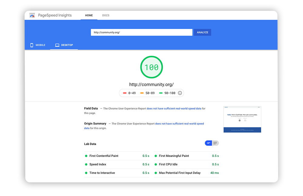
You can see how fast your website is by using free tools like PageSpeed Insights. They will check out your page’s speed and provide a breakdown of what is slowing down your page.
For your association’s website, this means you’ll need to keep load times as short as possible to even have a chance at engaging visitors. To help reduce your load times, Morweb’s guide to association website best practices walks through a few tips your team can implement with the help of a consultant:
-
Compress images. Many things can slow down a website, but images are often the primary culprit. Before adding an image to your website, compress it to reduce its file size without sacrificing quality.
-
Optimize code. Code allows your website to perform a number of complex functions, but unnecessary Javascript and CSS can slow down your pages. To optimize your code, you will likely need to partner with a web development consultant or switch to a website theme that is already built for quick loading times.
-
Reduce redirects. Redirects are a useful tool for ensuring visitors can find the pages they’re looking for even when you change an existing URL. However, each time a visitor clicks a link to navigate to a new page, they must wait for the HTTP request-response cycle to complete. When you add redirects, this process will get longer and longer as more requests will need to be processed.
Fixing loading speeds is not a one-and-done process. As your association’s website grows, you’ll need to regularly check your load times as part of your routine maintenance. For most associations this process will include removing duplicate images, cleaning up redirect chains, updating outdated links and information, and responding to any other UX issues that have arisen.
An engaging association website is fast and easy to use, allowing visitors to find the information they’re looking for in a manner of seconds. Of course, these websites are more than just efficient, providing visitors with insightful information and bold visuals that convey the association’s brand. To improve your association’s website, get started implementing these tips or reach out to a web development consultant for assistance tailored to your association’s digital needs.